ElectionVR: Mapping the popular vote for U.S. President in VR
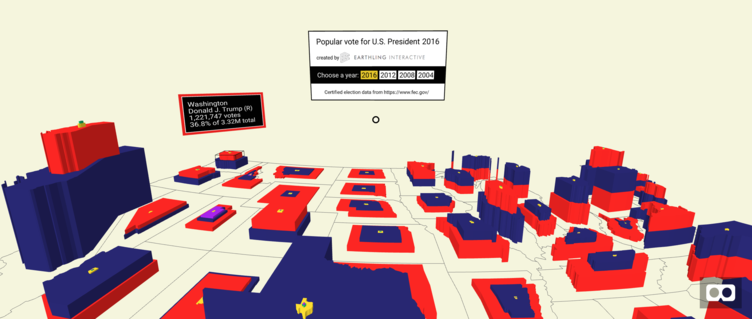
I recently submitted ElectionVR, a virtual reality data visualization, to the Virtuleap 2018 hackathon. ElectionVR is an experiment in using VR to give people a more intuitive and nuanced view of election data. It allows you to walk around a map of the United States and explore the data for the last four presidential elections, showing the number and percentage of votes that each of the major candidates received in each state. ElectionVR is built in WebVR so it can be viewed using the HTC Vive, Oculus Rift, Google Cardboard, or a Desktop browser. The Vive and the Rift support controller-based interactions to move and scale the map. The work was sponsored by Earthling Interactive (Thanks, Earthling!). Keep reading for more details or just click here to try it out.
The work was initially motivated by my frustration with the way that the results of the U.S. presidential election were being presented in November 2016. Most of the sites were using a simple colored map like this one by Politico:
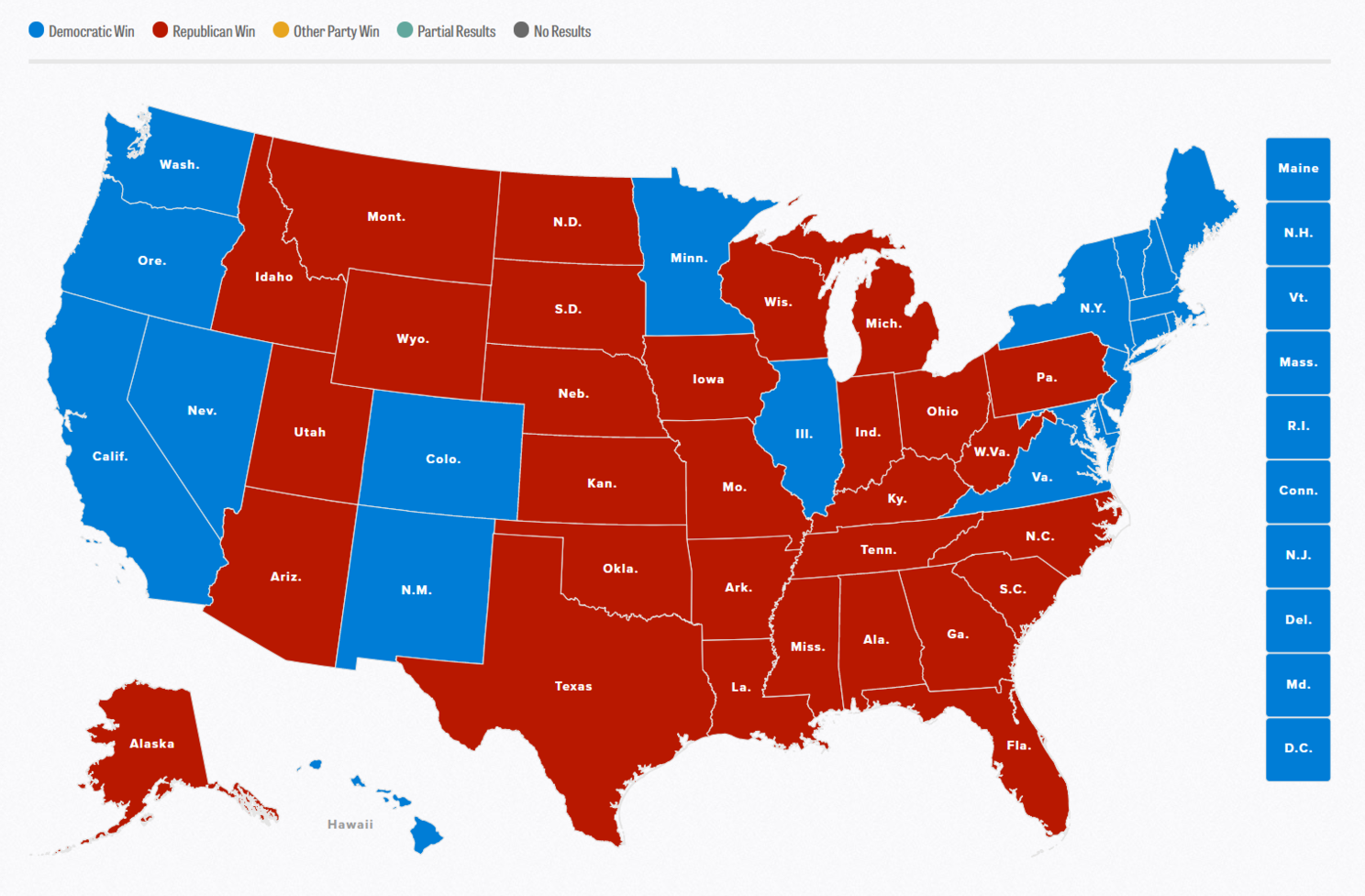
It hides a lot of information, such as how close were Trump and Clinton in different states and what happened with third-party candidates, who as some analyses suggest, could have changed the outcome of the election. It also hides the huge variation in the number of votes cast in different states, such as more than 8 million votes cast in California vs. 600 thousand votes cast in neighboring Nevada.
I had just started experimenting with ways to visualize data in virtual reality at this time. Virtual reality is good at showing relative scale, so I envisioned showing a map at your feet and the data rising up from the ground. The vote counts for different candidates would be shown like the rings of a tree trunk. My first 2D prototype in d3.js looked like this:
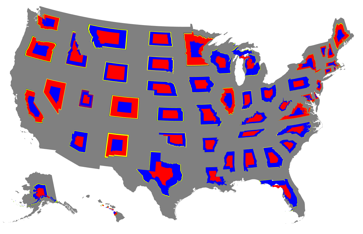
The width of each state ring shows the percentage of the popular vote that each candidate received. The center shape in each state was the winner. To show the number of votes in VR, I would extrude the shapes upwards. When I translated this prototype into 3D space, though, I found that the tree trunk ring was confusing and it was hard to tell who won and hard to see candidates who didn’t receive many votes. After doing user testing with my wife and son and experimenting with different options, I found that stacking the shapes on top of each other like a tower of blocks worked best:
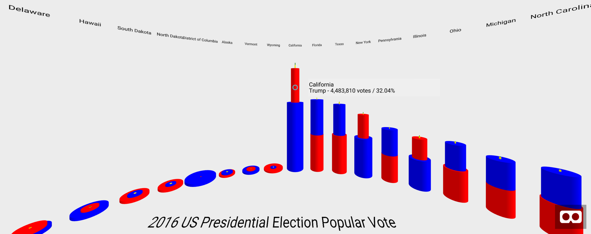
Here the towers are presented in a circle around the viewer, ordered from the most total votes cast to the least. The winning candidate’s cylinder is on the bottom. If two cylinders are almost the same size, then the vote was very close. This version of the visualization was closer to my vision, but it still hid information about the geography of the U.S. and in this election, the geography seemed important, as the two coasts were won by Clinton and the middle of the country was won by Trump.
It was a technical challenge to translate the cylindrical towers into 3D blocks shaped like the states. The VR library I was using, A-Frame by Mozilla, had a few open source mapping components but none of them provided the level of control needed for my visualization. I ended up having to write my own open source library, the aframe-geo-projection-component, which uses d3.js’s mapping functionality to create map-based shapes in VR.
In the published version of the visualization, you can see more nuances in the data, such as in 2016 more then 1 million people in the democratic stronghold of Massachusetts voted for Donald Trump and that almost 4 million people in Texas voted for Hillary Clinton, a state which no Democrat has won since 1976. You’ll also see the surprisingly strong showing of third-party candidates, such as Gary Johnson and Evan McMullin, especially as compared to previous elections.
An unexpected but welcome side-benefit of moving to the map-based visualization was that when using a room-scale VR setup, like the HTC Vive, there’s a greatly increased sense of presence – you feel like a giant striding across the United States. Being able to move the map around and change the scale with the controllers makes it fun to explore the data. On his first time trying it, my 11-year-old son greatly increased the size of the map, crawled inside of Texas, and poked his head up through the different layers of data so he could compare them. That sense of fun exploration doesn’t come through in the desktop version of the visualization, which points to VR having unique potential as a medium for visualizing data. It will never replace the fast efficiency of a 2D chart, but it could help us explore and make sense of complex data sets, particularly those that involve scale and spatial dimensions. More thoughts to come on that topic in future posts.
Along the way in working on this project, the challenge that surprised me the most was getting the election data. My naive assumption back in November 2016 was that I could go to a site like data.gov and download the results. I was even hoping to add county-level data to the visualization. I found out that the reality was much worse than I’d expected. To quote the Open Elections project: “No freely available comprehensive source of official election results exists.”
Each state has their own laws and methods for tabulating and publishing election results. In many states, the individual counties publish their results on the county website and the state aggregates this information onto their website. This process takes quite a bit of time, especially in cases where an election result was contested and a recount is required.
So where do the news stations get their data on election night? They pay the Associated Press.
During an election, the AP has people all over the country contacting local election offices to get election results as they come in and then the AP provides the results to their subscribers via a real-time API. The news stations and newspapers pull this data into their own systems and create pictures, articles, and commentary. The certified results don’t get published by the states and counties until weeks later. For those interested in learning more about the process, this article in Vox provides a good overview.
I contacted the AP soon after the election to see what the cost for the data would be, but didn’t hear back from them for months. In the meantime, I tried to cobble together the data as best I could. For someone doing data visualization, the data published by most states and counties are not very useful. Sometimes the results are in PDF files, sometimes in compressed Zip files, and sometimes in Excel. To compile all of this variously formatted data for a single U.S. election would be a huge undertaking, which is why the AP and sites like Dave Leip’s Atlas of U.S. Presidential Elections can charge money for the data. The Open Elections Project is working to create a free, public database of election data, but it’s a slow process and there were too many gaps in their data for my purposes.
Eventually (2 years after the election in question), the Federal Election Commission publishes the combined, certified election results on its website for free. These are the data used in the published version of ElectionVR. The data go back to 1982, but prior to 2004 the file formats are different so I didn’t put in the effort to convert those for use in the visualization. If you’re interested in seeing earlier years of election data or other types of data, such as Senate and House of Representatives results, please post a note in the comments.
The code for ElectionVR is open source and available on GitHub. Thank you for your interest in this experiment. I welcome any feedback you might have.
Edited 6/26/22 to change URLs to the working version of the visualization, since the old EarthlingLabs URL is no longer available.
Originally published on LinkedIn here.